House Tour: The Miller House
The Miller House features slate slabs, white steel framing, and walls of glass that slide open.
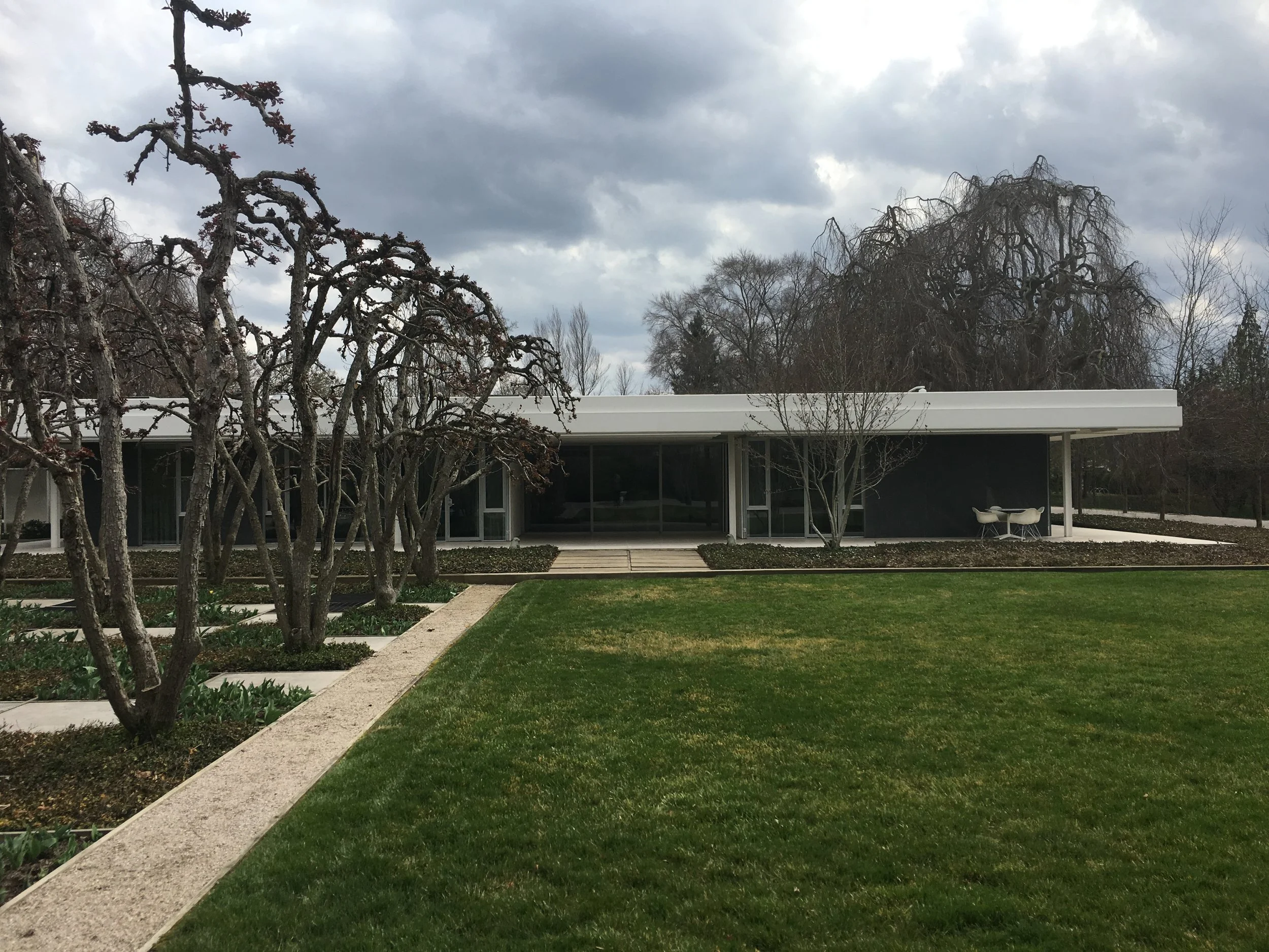
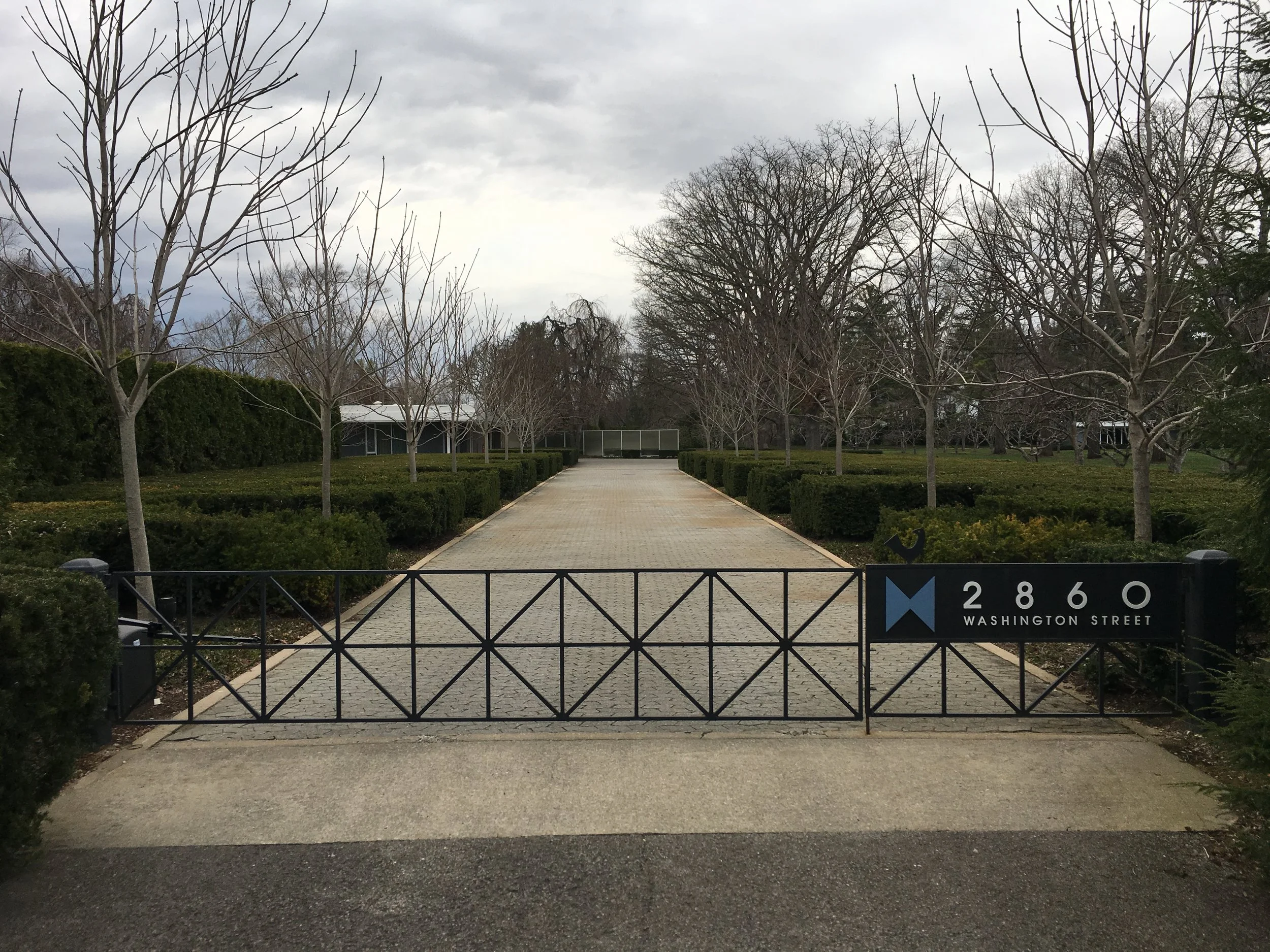
The Miller House, in Columbus, Indiana, is partially hidden behind a line of shrubbery. Entering the gated driveway a mostly white, single story dwelling emerges from the manicured landscape. With a carport centered on the rectangular house, the home is both impressive and unassuming. But come a little closer and the house begins to reveal itself.
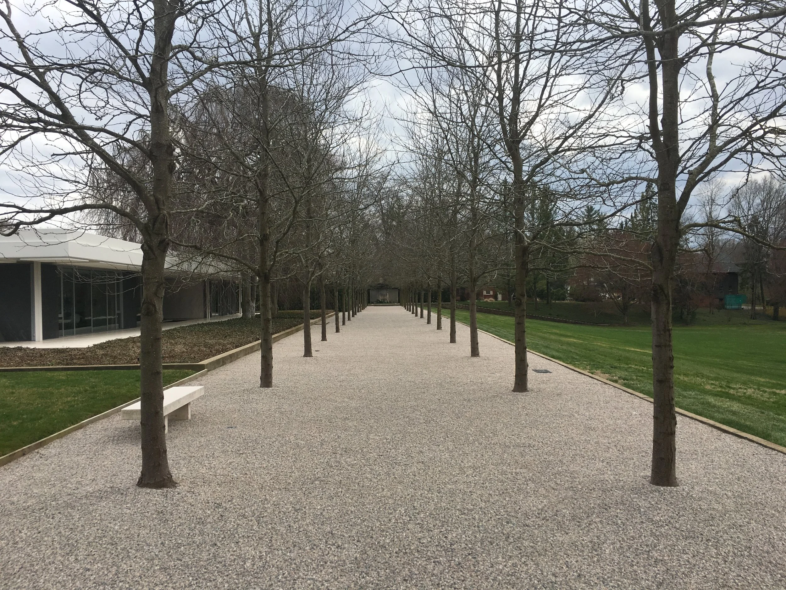
The dark gray painted exterior walls, trimmed in white, are actually massive slabs of hewn slate. The channels of light that run the perimeter of the house are long skylights that form a grid. The perfectly manicured grounds turn out to be the work of Dan Kiley, who also designed the grounds around many modernist structures including the St. Louis arch, La Defense in Paris, and Lincoln Center in Manhattan. Eero Saarinen designed the home. Saarinen’s work includes the St. Louis arch, the TWA Terminal at JFK, and corporate offices for GM and IBM. The Miller House was one of his few residential designs, but arguably, one of his best. Interior textiles, sourced by Alexander Girard, compliment the house and landscape perfectly. In essence, The Miller House represents a rare moment in design history where three designers, at the pinnacle of their careers, all collaborated together on one project. Right place; right time.
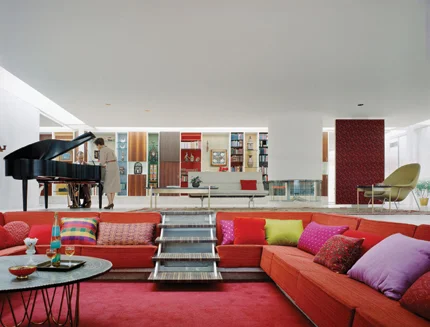
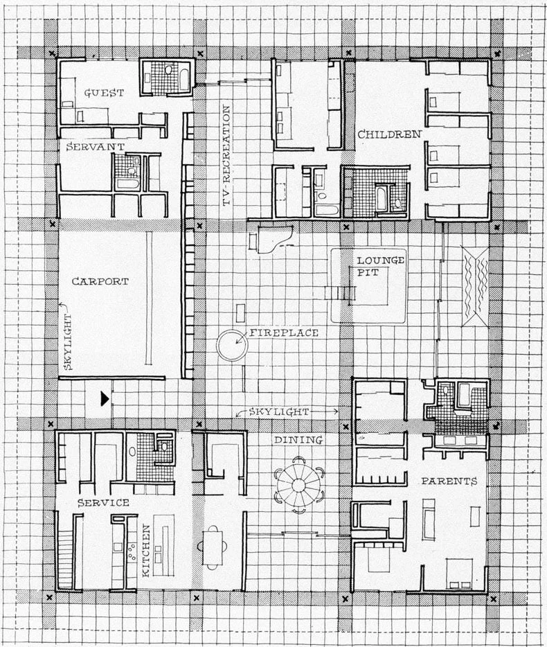
The glass doored entry to the home, tucked next to the carport, opens to a bright white space. Upon further review, the white walls are actually book-matched slabs of white Alabama marble. The floors are vein cut Travertine. In the living area, the focal point is the sunken conversation pit with lively Girard textiles which were changed seasonally to compliment the landscape outside. Continue looking and find a floating fireplace asymmetrically placed in a second seating area. The dining table is a multifunctional work of art. It rises from the floor on a built in base with marble slabs radiating from an impossibly slender single terrazzo column. It is lit from below to emphasize the floating appearance. In the center of the table, a circular piece of frosted glass is lit from below. Remove the glass to reveal an adjustable fountain which can be used as a centerpiece during dinner parties.
The sunken conversation pit is enlivened with textiles from Girard.
The most striking aspect of the Miller House is the liveability of the residence. In an area for kids, four bedrooms and two bathrooms share a study/play room. The master suite is large, but not overwhelming. It includes a nice bathroom, two walk-in closets, a small office nook, and a bedroom with sitting area. This liveability is proved by the fact that the Millers occupied the house, unchanged, for 55 years. When a rug began to show its age, the Millers had another rug made using the same specifications and company that produced the original. When curtains faded, the original fabric design was reproduced and the curtains were remade.
It is a common belief that mid-century modern homes are not controlled by the owner, rather, the home controls the owner. The Miller House rejects this belief. In this home, for 55 years, a family lived comfortably and in relative ease. Good design did not require alteration, rather and simply, appreciation.


